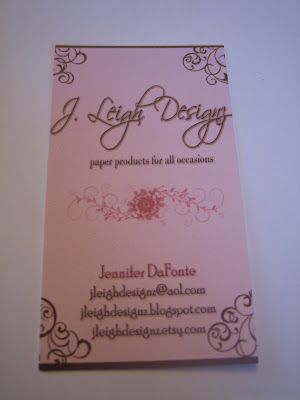
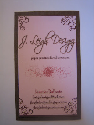
So I was chatting with hubby and showing my new business cards that Connie made me, she has an Etsy Store also. And he said well that doesn’t stand out to me for a paper person. And at first I was upset b/c I thought he was saying he didn’t like the card, but then he went on to explain that they should be something I make since I am a paper person. So, at first I matted it and he said okay.
 And then I added ribbon and he thought it was definitely more catchy this way and would probably grab your attention more in a stack of cards.
 So, I would love your opinions. Which card do you like best?

Mom Spotted ©2008-2019- All Rights Reserved


love the bow and matted card. Very professional looking. And the background on your blog looks great – it’s so 3-dimensional!
I like them either way, then again, I am biased!
The only problem I can see with the actual bow is that it would be hard for someone to stick in their wallet without ruining the bow somehow, and with the matting it mght be too large to fit in some card holders, etc.
But aesthetically it is nice!
~Connie
I agree with Connie about the bow. I think it would be a great card but the bow would definitely get in the way in my bag!
Can you frame it but keep to the regular size of a business card? I think you are onto something!:)
I like them all but I think I like the 3rd the best!
I got my wall piece from Uppercase Living – just google that!
I agree with Connie, but I think matted or bowed – they both look awesome!
At first I LOVED the matted with the bow (still do), but when I read Connie’s comment I have to agree that as a business card, it would be difficult to manipulate. As a paper person (and I know this would be time consuming), you could print your own (most software programs leave an unprinted margin) then cut out around the margin, matte them onto a contrast that is standard business card dimensions, and then utilize die cuts to give it a pop, or a little something extra? The overall feel is great! and it compliments your etsy banner and blog wonderfully.